Creative Process
Every artwork I create is different, but all of them have something in common. My signature style is an effect of a painstaking trial and error process, mixing various platforms and tools.
-
I will be honest — my best ideas start in weird places. Like that time I was looking for some hidden gems on a local flea market. All those random pieces of cutlery, watches and some doubtfully collectable chotchkies when I noticed something that caught my eye - it was a small amber brooch. I’m not sure if it was exactly the one or not, but it reminded me of the one my grandma used to wear on special occasions (like the Sunday family dinners). While she was preparing the feast, she’d hum folk songs while cooking. It’s that peculiar sense of belonging, that fleeting feeling of content. The sweet memories usually are closely followed by undoubtedly less enjoyable ones, like the panic I felt in a too-bright office tower during my corporate days.
I feel like a detective, but instead of solving crimes, I’m piecing together memories that make my heart race. Think of it as emotional scrapbooking: Important memories + Kociewian floral patterns + existential dread = Peter Gil “art magic”. Shoutout to artists like Louise Bourgeois, who taught me that even grandma’s linens can hold epic stories.
-
This part’s messy. I open Procreate and start doodling shapes that feel like my brain on caffeine and a couple of cigarettes. Maybe an elaborate flower that’s also a maze? Or a geometric pattern that whispers, “Remember that time you cried in therapy?” I’ll scrap 20 versions before landing on one that clicks.
It’s like dating: swipe left on boring, swipe right on chaos. Fun fact: My hero Vera Molnár—a digital art pioneer from the “70s — did this with old-school computers. Me? I just yell at my iPad.
-
Once I’ve got a sketch that feels alive, I turn it into a super-detailed digital map. Imagine planning a road trip where every pothole is a brushstroke. I borrow tricks from the Polish Poster School legends—they mixed folk art with graphic design like rockstars.
Here’s where I obsess over colors (that teal? It’s exactly the shade of my childhood schooter) and textures (scanned from my grandad’s 1960s sweaters). It’s part math, part mood board.
-
Quite self explanatory, don’t you think? You’d be surprised by how many little errors I’ve noticed only after seeing the artwork in the full scale. Sometimes it takes two or three, others more like eight tries before I’m actually content with the design in its final size.
-
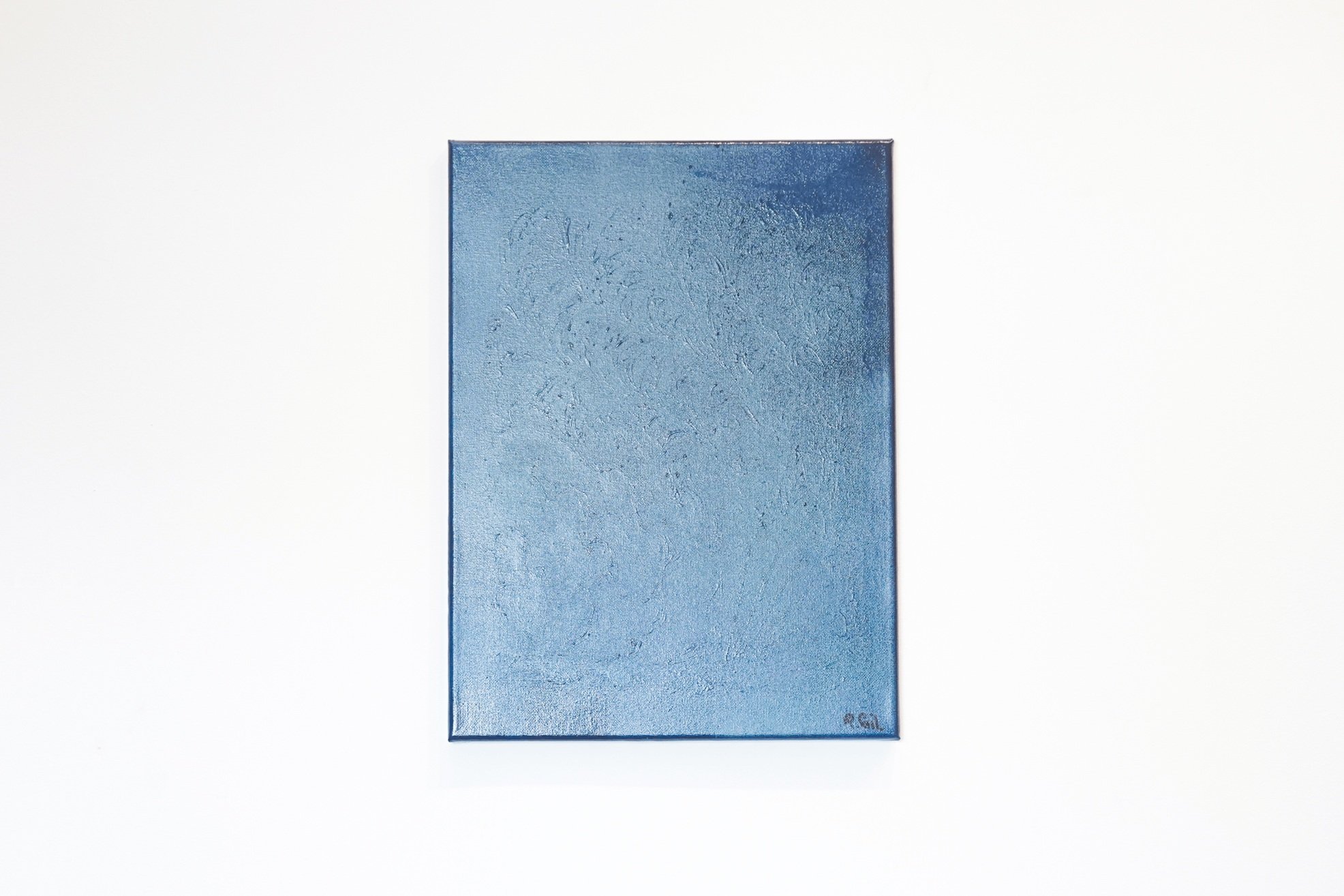
Time to get dirty! I slather thick oil paint onto canvas like I’m mad at it. The digital plan becomes more of a suggestion. Oils have minds of their own — they mix, bleed and surprise me with every brushstroke.
One minute I’m channeling Rembrandt’s shadowy drama, the next I’m ripping a page from Magdalena Abakanowicz’s playbook, letting materials rebel.
That “perfect” floral pattern grows fangs. A serene blue mutates into stormy gray, bloody burgundy starts shining with golden hues.
It’s a beautiful disaster.
TL;DR: My process is like making pierogi from scratch — messy, personal, and much better when shared! If you’d like, I will be happy to share all my dough tips and tricks!
To connect with Peter, see more about the work process and some insight into his vision, proceed to artist’s social media profiles.


